Canva Home and Editor
Two connected programmes with one aim: make Canva predictable, from the moment someone starts a design to the moment they publish it. I led the content strategy and systems thinking for both: the information architecture, the taxonomy, and turning decisions into reusable components.
- My role
- Senior Design Manager and Content Design Lead, Design Experience
- When
- 2026, Sydney
- Team
- The Editor System working group, Design Experience
- Result
- Visual system shipped. Editor strategy finalised.
The context
Canva covers a huge range of design types, from presentations and social posts to videos, print and documents, and dozens of teams build into the same two places: Home, where every design starts, and the editor, where every design gets made. Each addition makes sense on its own. Together, over years, they add up.
Simplifying these surfaces became a company-level goal. Two programmes took it on. Creation flows and the visual system looked at how people start. The Editor System looked at how people edit and publish.
The problem
- Starting took too many steps. Broad category icons bundled many design types together, so it wasn’t clear where a click would lead, and extra screens sat between choosing what to make and making it.
- Surfaces had no clear job. Menus had grown long and mixed file actions, view controls and settings. People looked in several places for the one thing they came to do.
- The same task took a different route. Publishing worked differently on each device, so habits didn’t transfer.
- Everything was shown to everyone. Controls that few sessions used sat on screen for every kind of design.
There was an organisational problem underneath. The most visible spots improve discoverability for whatever sits in them, so every team has a good reason to want one. Without shared rules, each decision was argued from scratch.
Part 1: Starting a design
Agreed the direction first. Before designing anything, we aligned on five things: one click from Home to the editor, a scalable icon system for design types, a protected space on Home for what each person uses most, a “See all” page for exploring, and keeping tools and shortcuts distinct from design types.
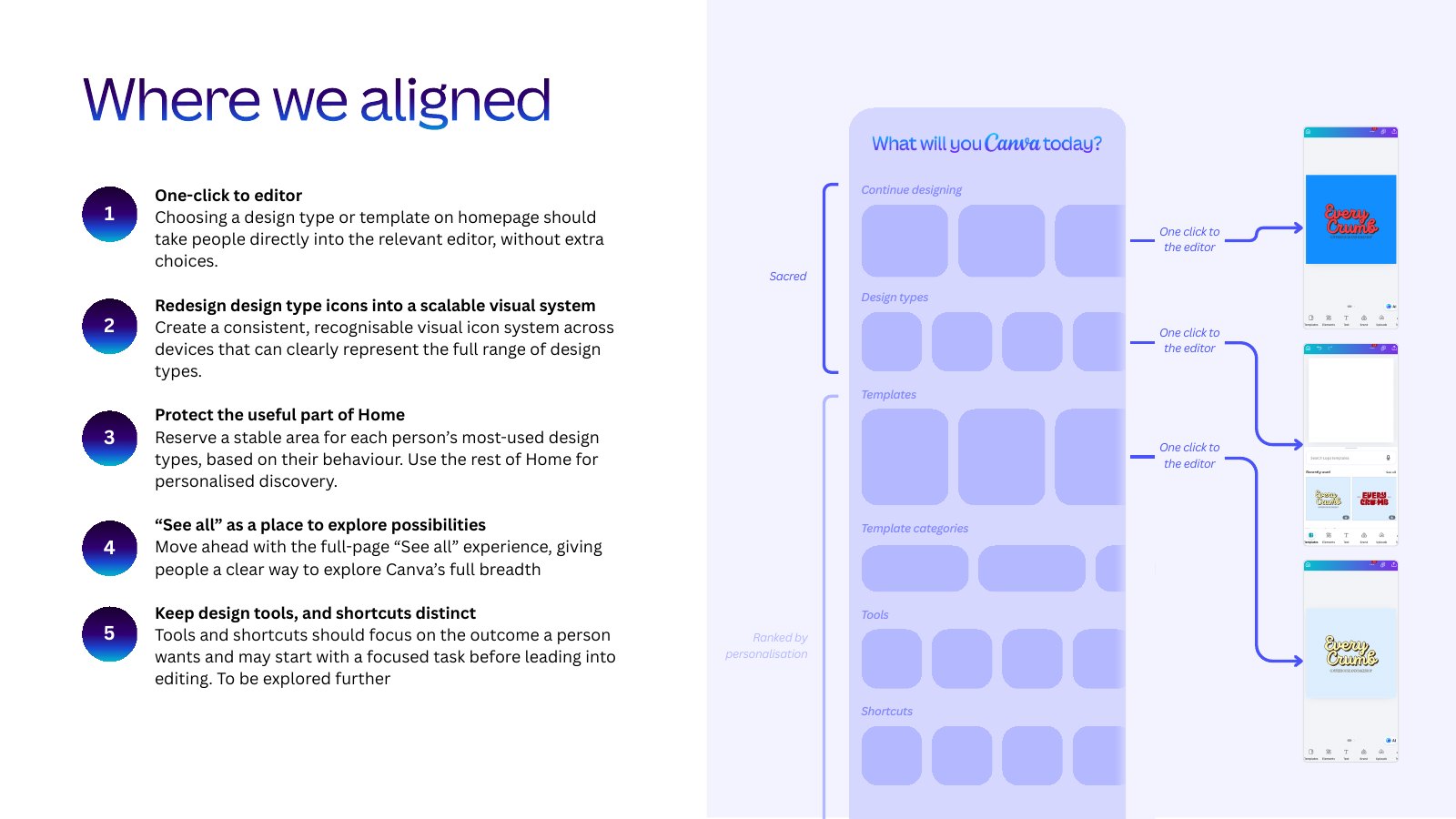
One click to the editor. Choosing a design type or a template on Home should take people straight into the editor. We wrote each change as a hypothesis: if we do this, we expect that, because of this. That made every proposal something we could test.
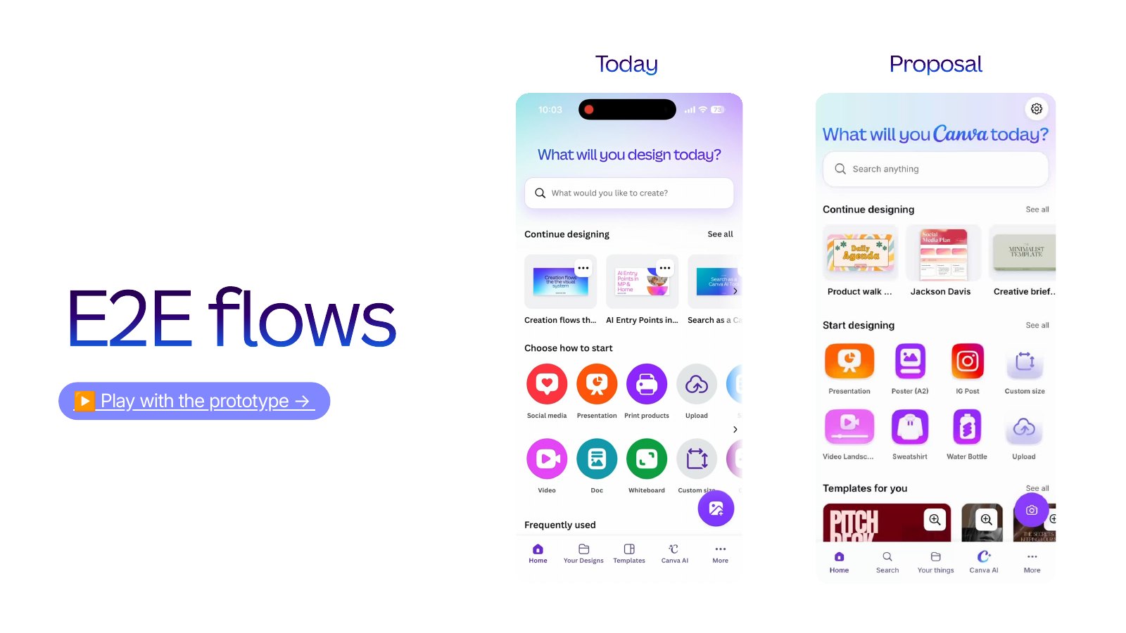
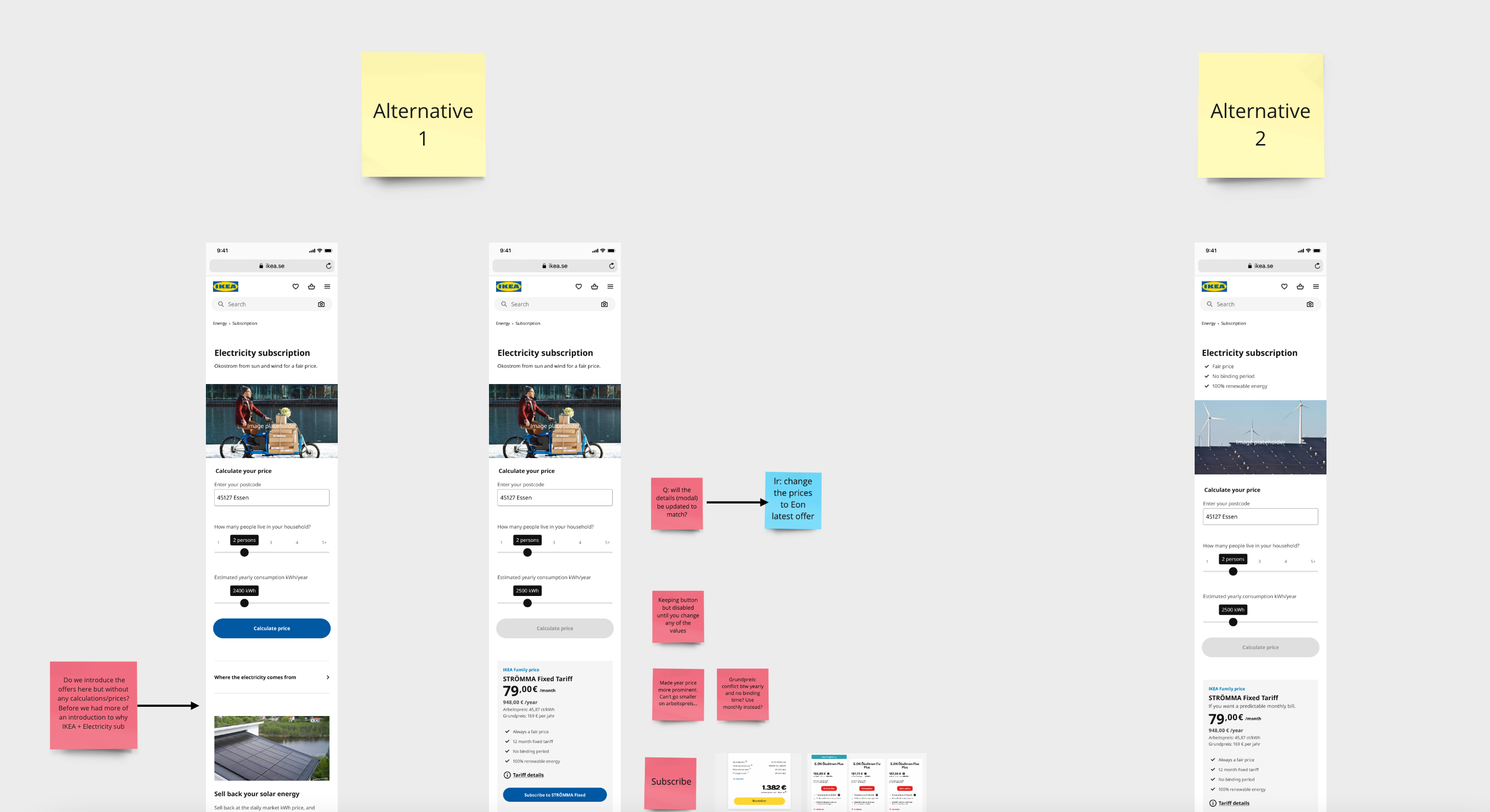
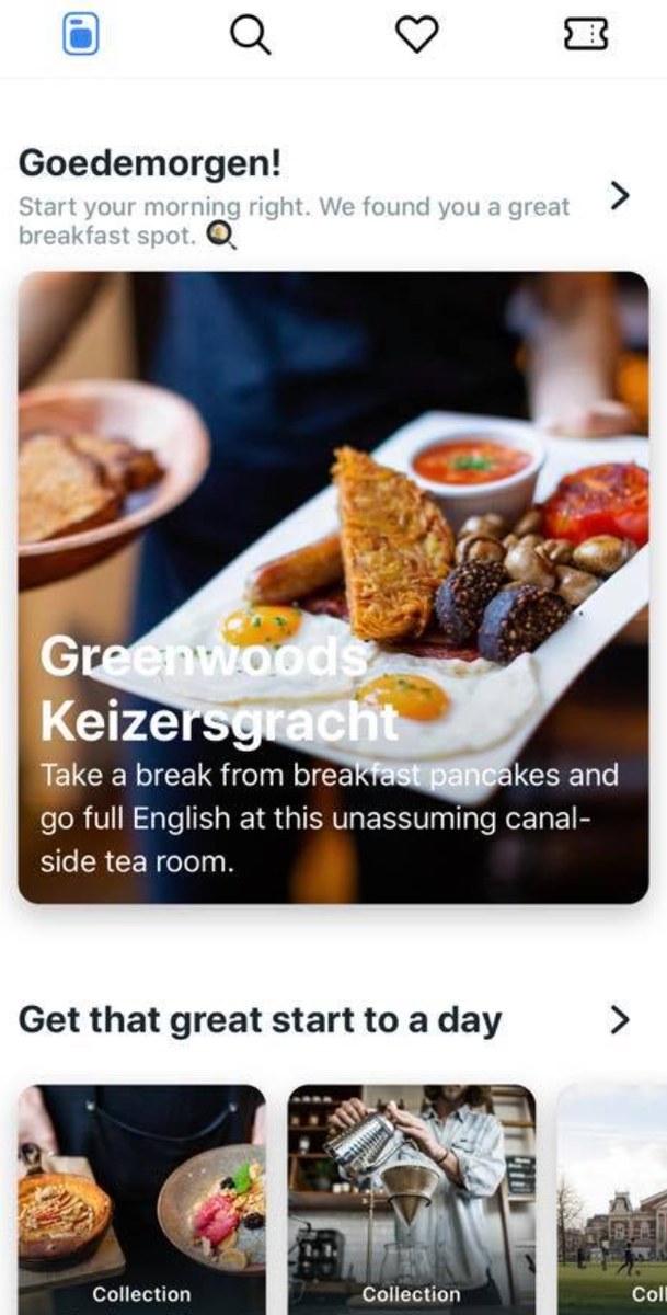
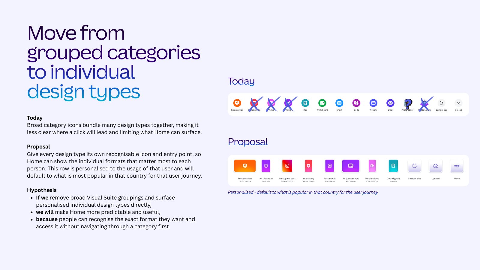
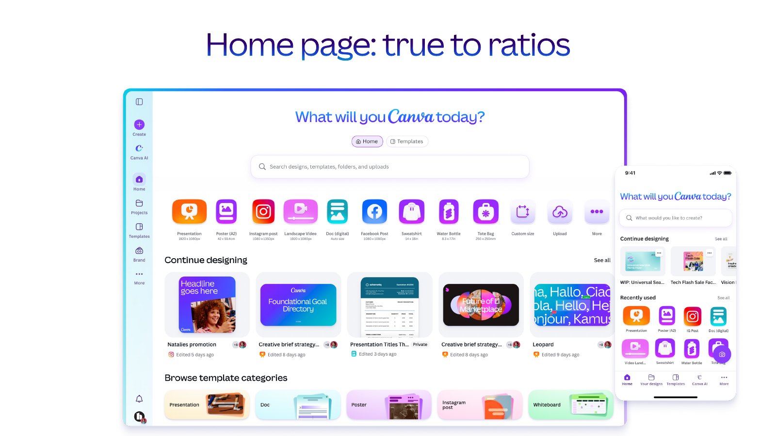
Every design type gets its own way in. We proposed replacing the broad categories with an icon and entry point for each design type, so Home can show the formats that matter to each person. The row is personalised to how someone uses Canva, and starts from what is most popular where they are.
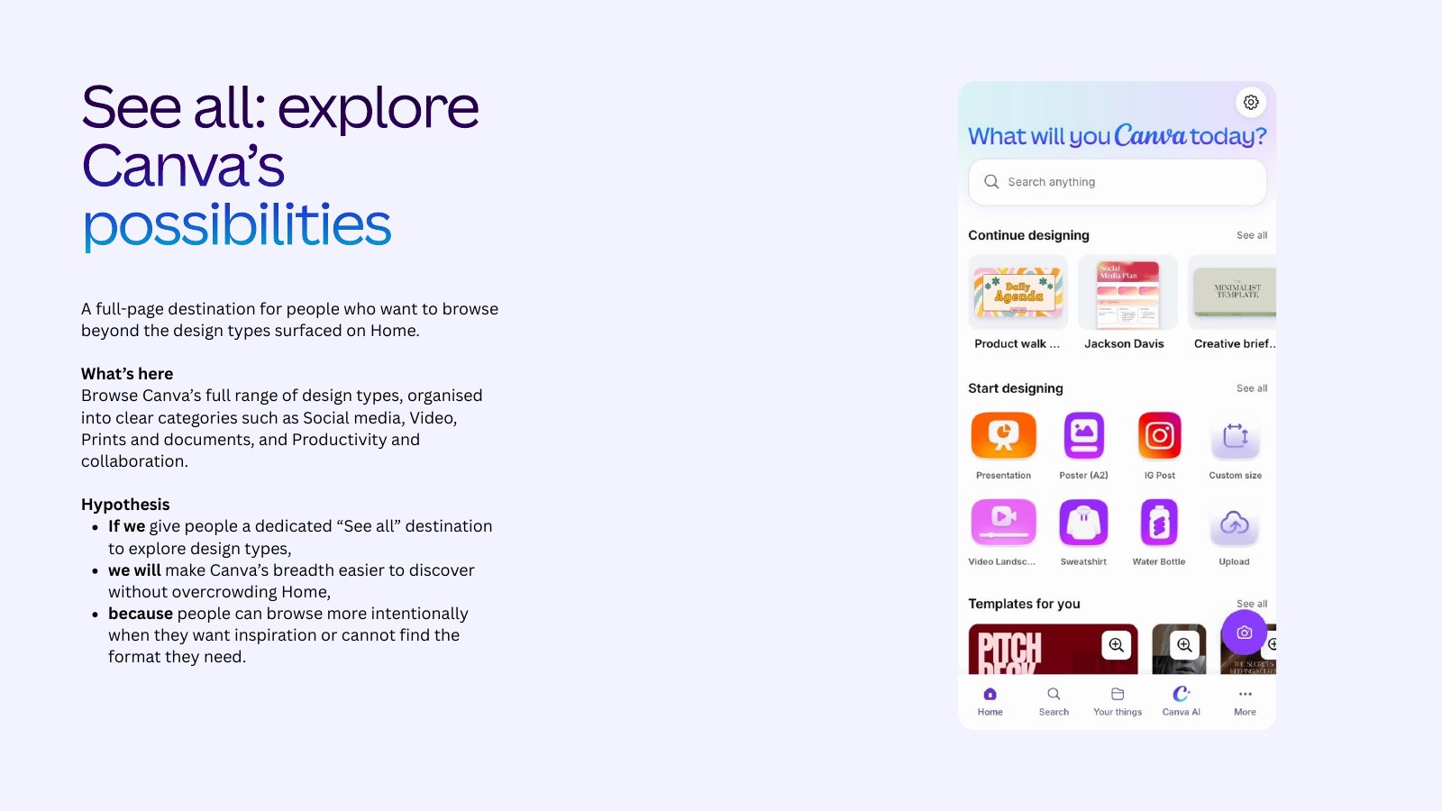
A place for everything else. A full “See all” page organises the whole range into clear categories. People who want to browse can, and Home stays focused.
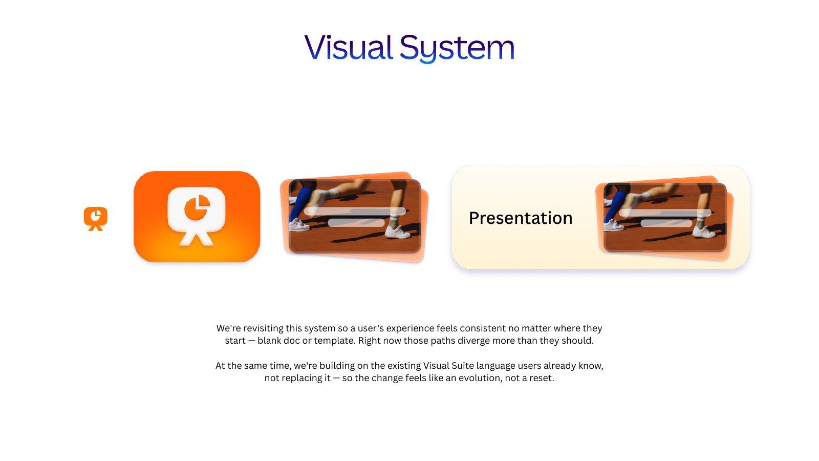
Three rounds on the visual system. The icons had to work as a system. They needed to stay recognisable on every device, cover the full range of design types, and feel like an evolution of the visual language people already knew. The team explored this over three rounds, testing each direction in the places the icons appear, and carrying one language through from icon to tile to template card.
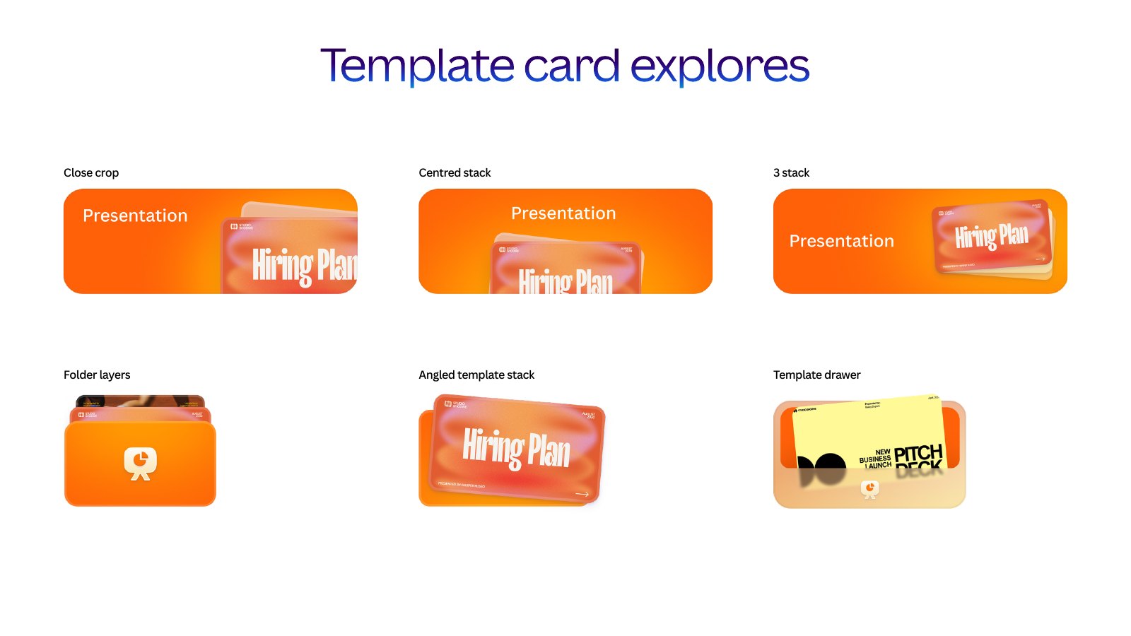
Named the trade-off. One proposal was to remove the guided step that appears between choosing a design type and reaching the editor. It saves a click. But our own data showed that step was doing real good: fewer people abandoned a blank design, and more started from a template. So the proposal said so, set out what we might lose, and came with a mitigation: offering template choices inside the editor as it opens.
Part 2: Making and publishing
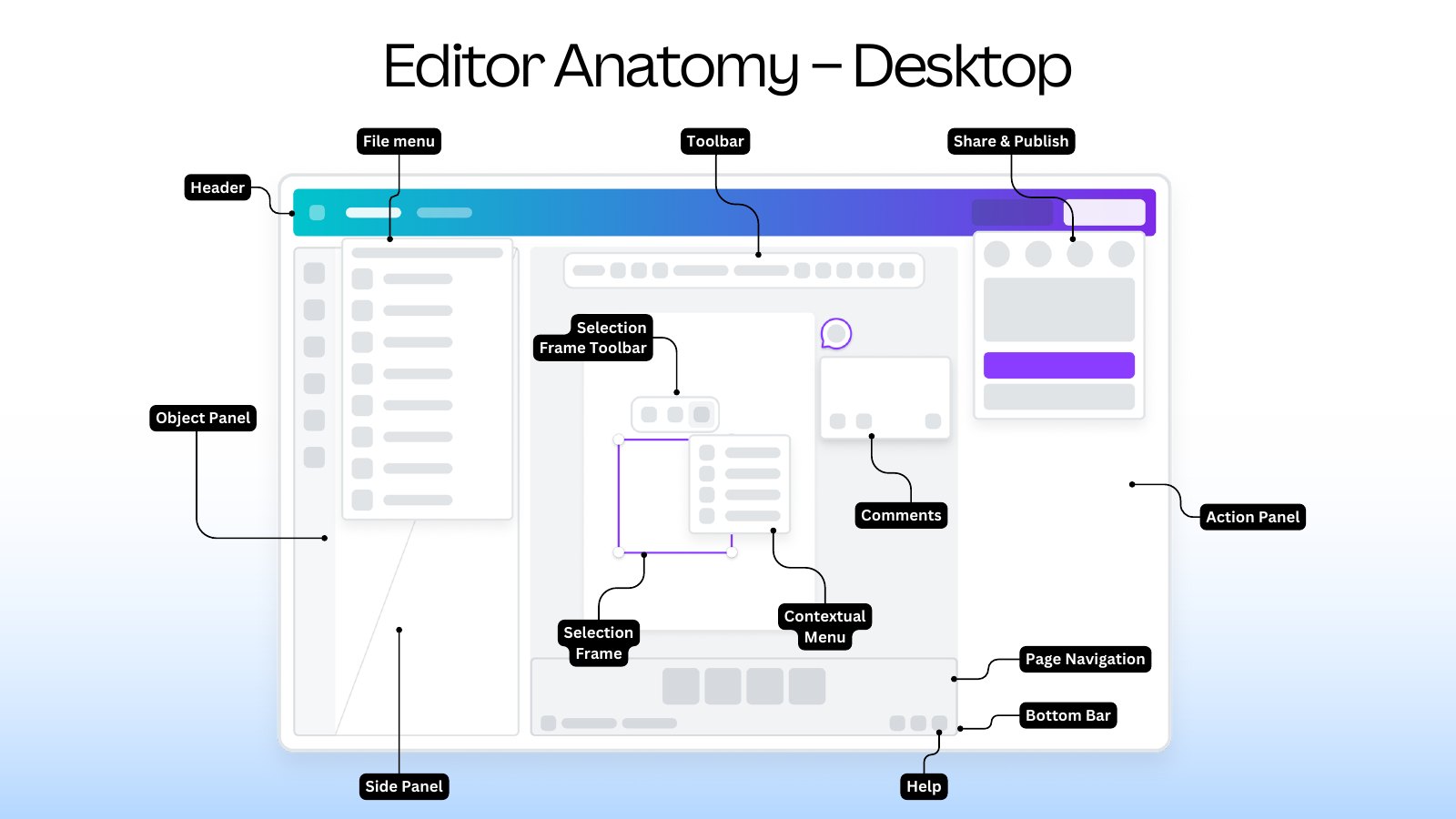
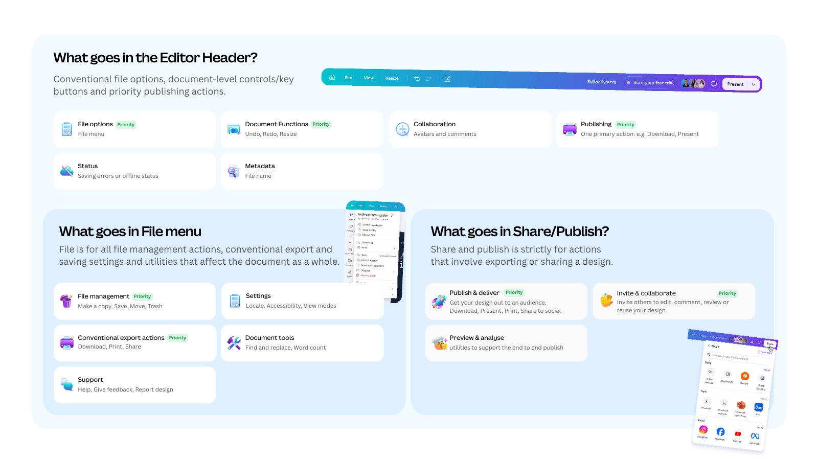
Gave every surface a job. This is information architecture at the scale of a whole product. We mapped the anatomy of the editor on desktop and mobile, then defined what each surface is for and what belongs in it. Once a surface has a job, “where should this go?” has an answer that doesn’t depend on who is asking.
Used principles to make decisions. We applied a shared set of product principles to every proposal: give each surface a clear job, keep familiar controls where people expect them, and stay consistent by default while tailoring only where a different kind of design needs it. Each problem was tagged with the principle it broke, which kept reviews about the principle, not personal taste.
- Evidence
- Usage data
- Support feedback
- Usability testing
- Principle
- Which rule does this break?
- Proposal
- Before and after
- Clickable prototype
- Test
- New and existing users
- Decide
Simplified the header and menus. The header was reduced to file options, document controls and one primary action. The File menu had become one long list, so we split it: File for managing and exporting the design, and a new View menu for how you look at it.
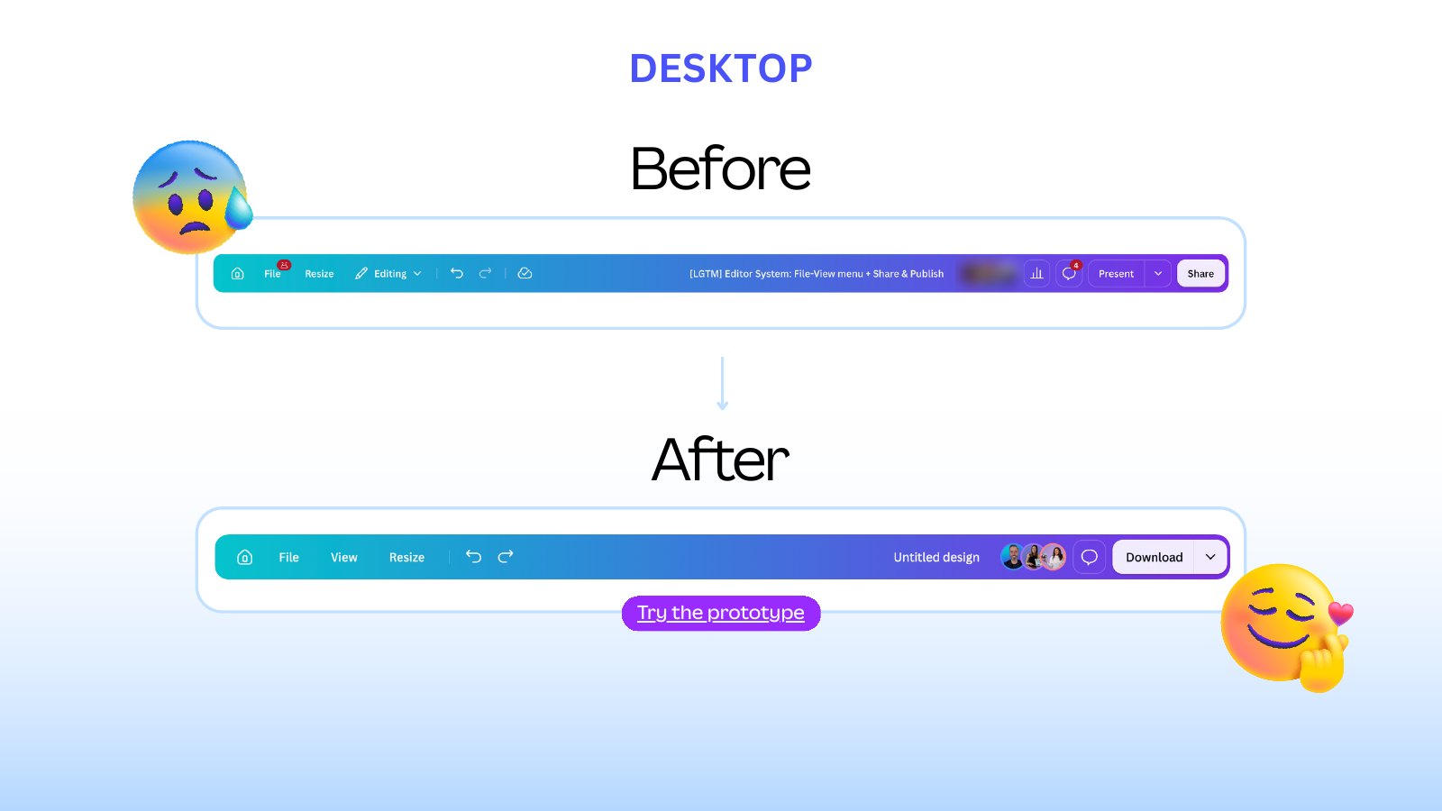
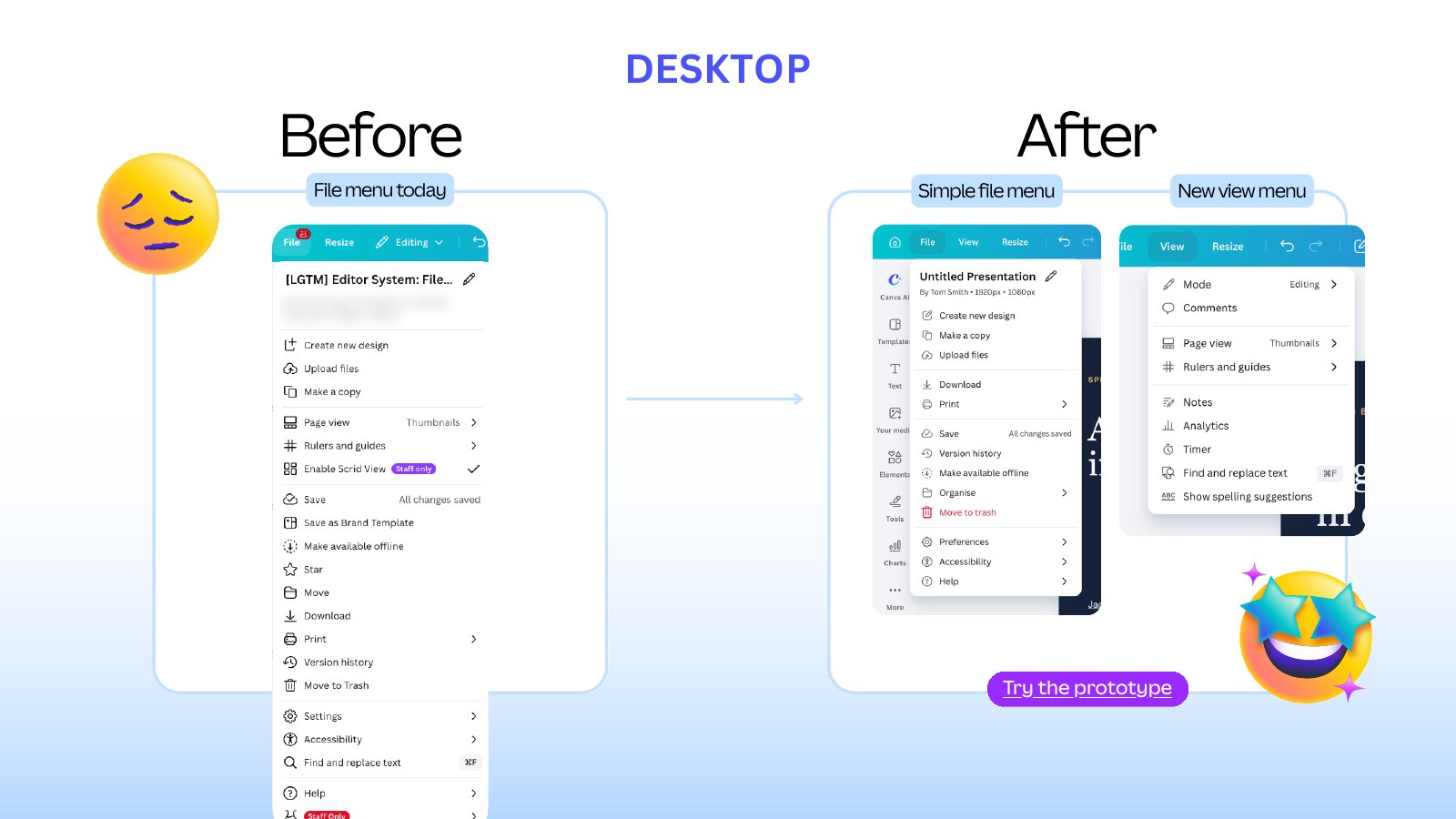
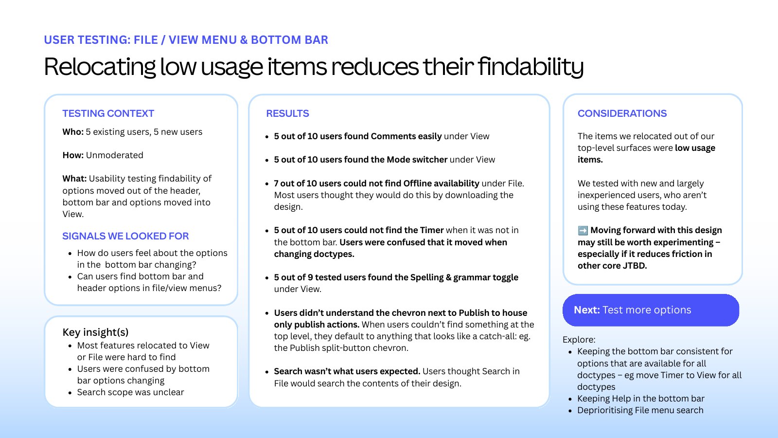
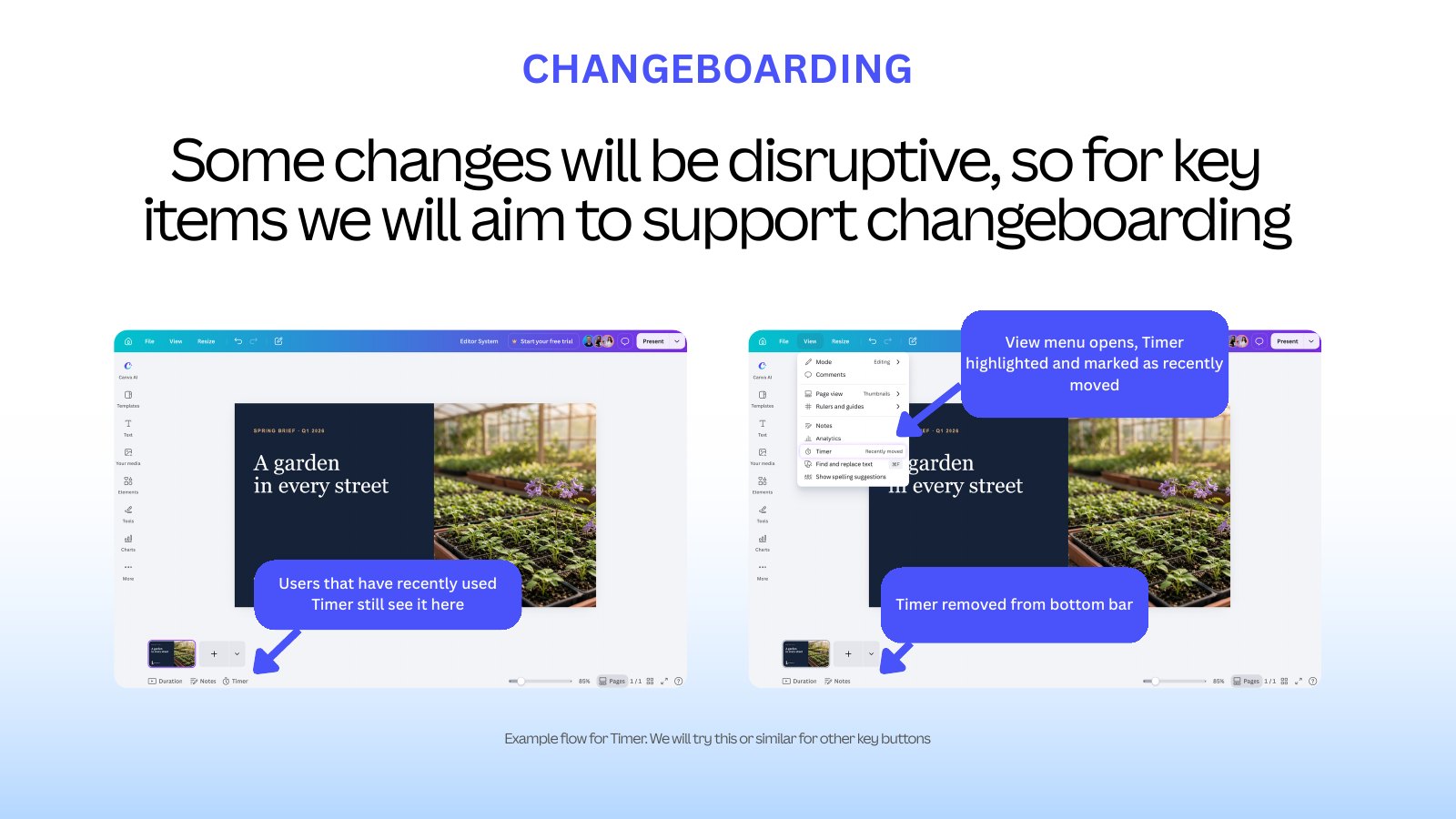
Listened when testing disagreed. We tested the new menus with five existing and five new users. About half couldn’t find some of the items we had moved, and people were confused when controls changed between kinds of design. We didn’t drop the direction or ignore the result. We narrowed what moved, kept more of the layout stable, and designed guidance so that people who had recently used a control were shown where it had gone.
One clear way to publish. Most people choose the same end point for a given kind of design. So we proposed one publishing button whose main action reflects what people most often do with that design, a few alternatives beside it, and everything else one step further away. The structure stays the same everywhere, and only the main action changes.
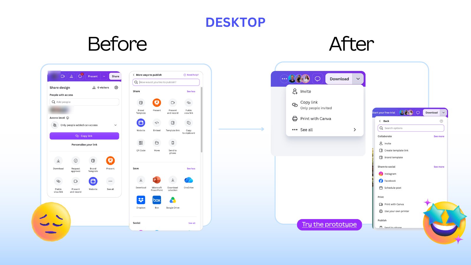
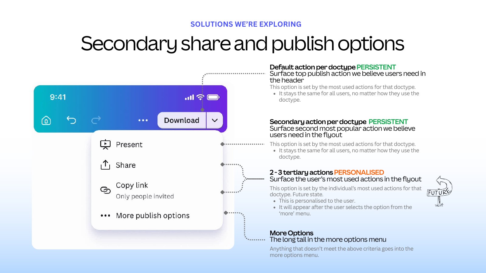
Turned decisions into components. A decision only holds if teams can reuse it. Wherever a pattern was settled, such as the publish button and its menu or the view control, the aim was to make it a component in the component library, so every team gets the same structure and labels by default.
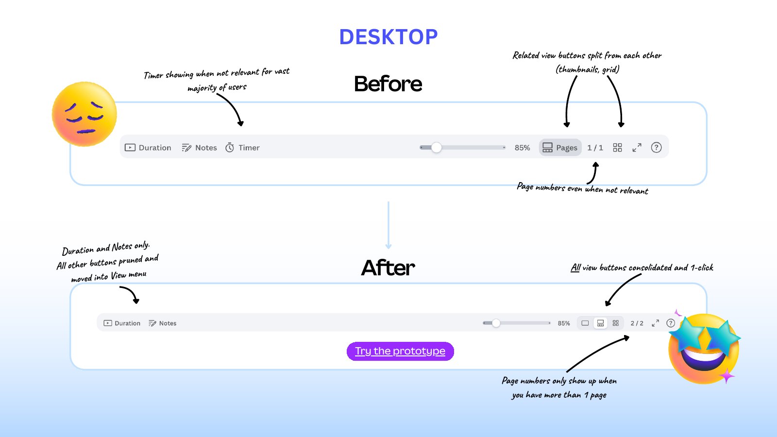
A calmer bottom bar. We kept the controls people rely on, moved the rarely used ones into the View menu, and brought every way of viewing pages into a single control that behaves the same for every kind of design.
What I led
- All content strategy. I led everything content-related across both programmes, working with the Editor System working group in the Design Experience department.
- Information architecture. What each surface is for, what belongs in it, and in what order. The header, the File and View menus, Share and Publish, and the “See all” page are all information architecture decisions before they are visual ones.
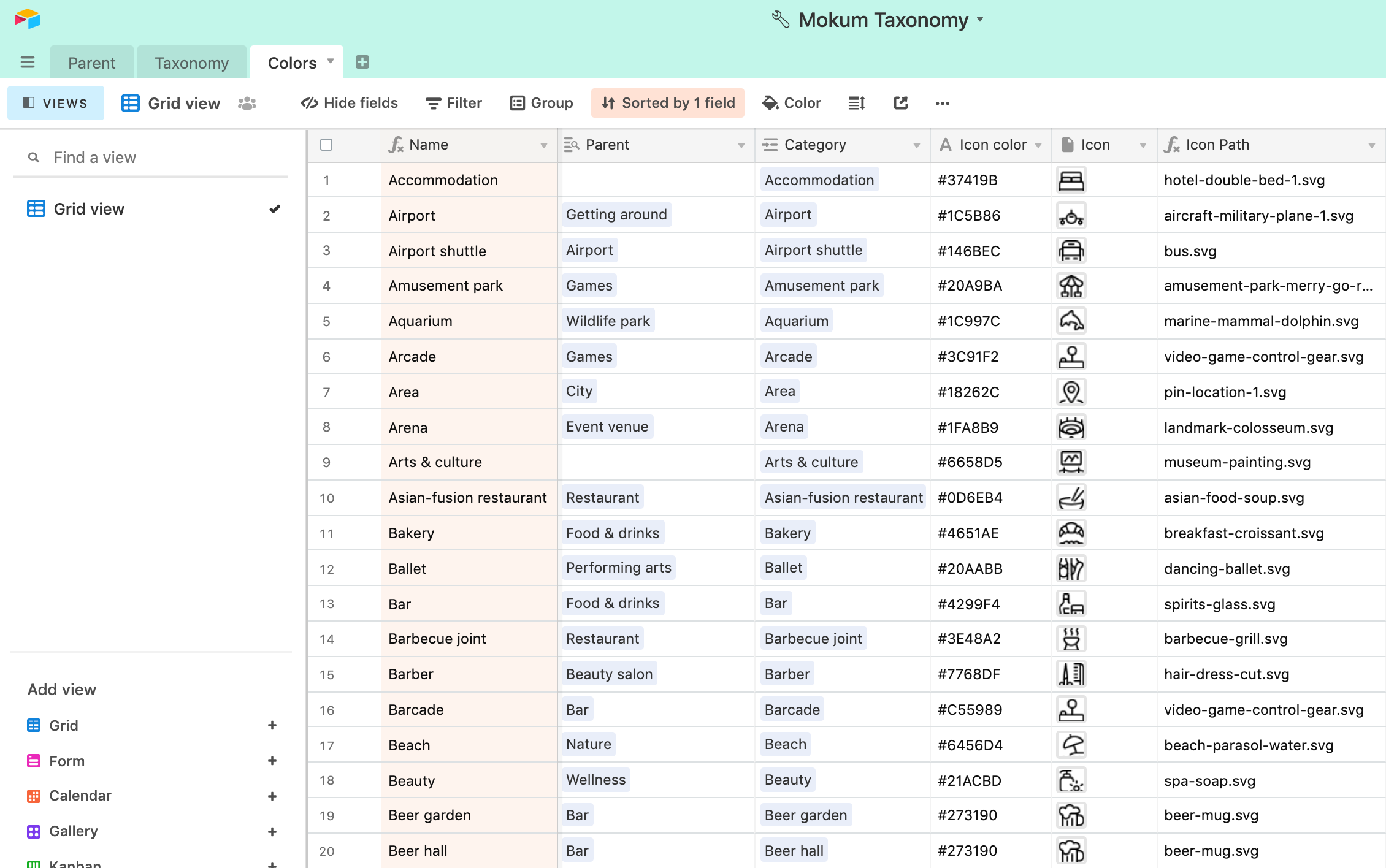
- Taxonomy. How Canva’s design types are named, grouped and categorised, so the same thing is called the same thing on Home, in menus and in the editor.
- Systems thinking. I pushed every decision towards something reusable. Wherever we could, a pattern became a component in the component library, so consistency is built in and doesn’t depend on each team remembering the rules.
- One source of truth. The strategy, status, evidence and decisions for the Editor System lived in a single document that was kept up to date, so any team could see what was changing and why.
- Decisions that leadership could make. Options went to senior leadership as a small set of alternatives, each with its benefits, risks and a recommendation, usually starting with the lowest-risk change that solved a real problem.
The outcome
The visual system shipped. For the Editor System, the definitions and decisions in the strategy were finalised, and the current product is being audited against them.
What I learnt
Simplifying is not the same as removing. An extra step can be helping people, and a control few people use still matters to the ones who do. The work is deciding what earns its place, saying what it costs, and giving everyone else a clear way to find what moved.